It's been a chaotic week, but I'm back at the video grind! Part 2 of the gacha drama video is going to be very, very long: long to the point where I have to either do another round of material cuts, or make a Pt. 3. At present, I'm about halfway done recording Pt. 2, and just that alone is already weighing in at 50 minutes runtime.
That said, I think it's some of my best work yet! I sincerely hope that you'll enjoy it, and won't find the intense history lessons too difficult to get through.
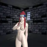
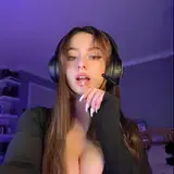
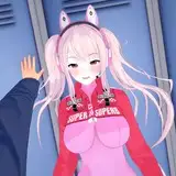
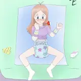
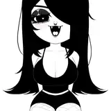
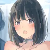
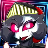
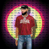
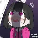
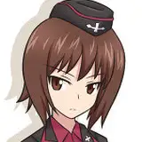
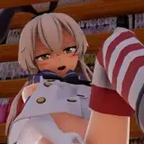
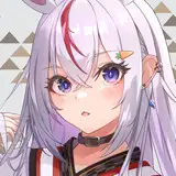
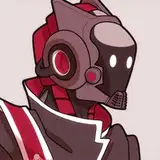
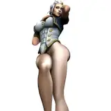
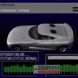
I've attached some prototype thumbnails! All the text is a work in progress: the final text will likely read "Gacha Gender War Part 2." The character in question is Furina, from Genshin Impact. You may be asking yourself, what is that blimp thing in the background? I don't want to give too much away, but here's a sneak peek:
https://www.reddit.com/r/gachagaming/comments/18ndukf/since_hoyoverse_did_not_response_to_the_protest/
It is exactly as bizarre as it seems, and then some.
Let me know what you think of these thumbnail designs, and help me decide which one to use! I'm personally quite partial to top right and bottom right, but all of them are quite promising!
- Moony
B. Rob
2024-01-28 05:02:14 +0000 UTCB. Rob
2024-01-26 21:19:37 +0000 UTCGoldkodak
2024-01-25 21:42:25 +0000 UTC