Hey everyone!
You've just finished a nice drawing and you feel proud about it. You even added some values. But then the color phase comes and you have no idea what palette to choose. Your colors look saturated, too dark, or they are a total mess.
Today, I'll share a very simple coloring exercise for you to try with your characters or any kind of composition you're creating.
1. Mid Tones Color
In my past article "My First Time Using Outfit Values - Moon Kutepunk Process + File", I mentioned how you can split your character's outfit into 3 simple values. For color, I'll recommend you do something similar, but for this exercise, let's choose two primary values and add colors to the mid tones only.
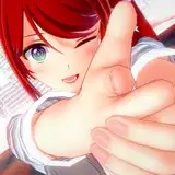
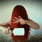
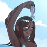
Leave the bright and dark tones desaturated. They'll serve as a complementary companion to the mid tones you decided to color. Take the red illustration I share as an example: the mid tones are red (hair, sweater, legs) and bright values (skirt, socks, shoes, part of the coat).
You might notice some exceptions like the skin, but considering the size in the composition, it's fine if some parts deviate from this rule, as long as they share similarities in terms of tonality or complementary palette.
This method gives you certain limitations for you to experiment with, without losing the interesting contrast and simple readability of your work.
2. Choose Only One Color
I know you love colors, but it's very easy to lose balance among many options. Instead of having one color for each part of the body, start by selecting your mid tones and then add one single color.
You can experiment with variations of that color making it a bit brighter/darker or more/less saturated but ensure you add the exact same color to all the sections you plan to color.
Just like the previous suggestion, this approach will give you limitations. These restrictions, however, will help you master one tonality and gain control over your color usage.
3. The Use of Complementary Colors
Contrast is crucial. If everything is grey, it ends up looking dull. If you've followed the last two steps, you'll already have a fair amount of information in terms of contrast, though mostly related to values.
If you want color contrast, you don't need to add two or more random colors. Instead, select the complementary color of the main palette you're currently using and add it to small shapes. These should not be big enough to distract from the main color just a little touch.
I recommend you color an interesting shape with this complementary color, as it will become a point of interest. In the red example, it's the little star. Using complementary tones this way will make your palette more dynamic and visually intriguing.
Conclusion: Learning to color is not easy, but in my opinion, my worst enemy is the number of options I have. It makes me feel overwhelmed and lost. Making it simple at first helped me understand how to create interesting compositions under limitations, and after feeling comfortable, I eventually end up adding new layers. I think this can help you too. Please feel free to share your process on our Discord!
Tomorrow, I'll be sharing the PSD so you can check how the Photoshop filters can merge all the palette into a similar tonality at the end of the exercise, along with some other tricks I usually add as an extra. During the video process, you will find how these steps are applied in case something is not clear enough!
If you are new here, WELCOME! Your support makes it possible for me to keep making content like this. If you have any questions, feel free to DM me here or on Discord.
For more information, check out our Patreon FAQ: https://ramonn90.myportfolio.com/faq and Patreon Catalog: https://ramonn90.myportfolio.com/work
Thank you and have a great week!
Ramon Nuñez
2023-06-27 17:26:39 +0000 UTCS A B I O
2023-06-27 14:57:41 +0000 UTC