Hey everyone!
As artists, we want to create a strong impression on our viewers, something that prevails in their memory. And I think one of the most powerful visual ways is through values and colors. Setting proper lighting and a balanced colored composition can evoke feelings in the audience. So how do we do that?
Today's post is a bit different. Usually, I address a point/problem with a consistent set of steps and exercises for you to execute, but this time I wanted to adopt more of an introspective research approach in relation to color. So while I uncover this valuable insight, you can also find insights. Although I'm still grappling with the full complexity of this topic, I'm excited to share my journey with you.
This is usually my approach when learning things:
Awareness
Today, for example, the question I became aware of was, "Why can I remember/feel specific colored shots from Guillermo del Toro Films?" Let's jump right in.
Description
From a personal standpoint, I've seen numerous movie pictures throughout my life, but one of the shots that frequently come back to me are the ones from Guillermo Del Toro's movies. I find them to be "one color" oriented. This does not mean that the compositions have one color, but rather that I remember them as being predominantly oriented towards blue, or red, or yellow, etc. This is probably common in some other directors as well.
My goal is to evoke this same phenomenon in people through colors, like it happens to me. So if I were to describe the feeling, it would be something like this:
"It seems to me easier to get into a mood when the color palette or values are simple to the point where one color is the main protagonist. But when many colors and values dominate the composition, I cannot feel anything or feel very little. Why is that?"
This is a question I hope to answer pretty soon, but spoiler alert, it might be related to human psychology.
Research
So I did some quick research, and here are some observations related to key elements of color theory, visual perception, and human psychology that might be useful for you as well:
- Simplicity and Focus: When a color palette is simple or when one color dominates, our brain can easily process the image and focus on the emotional tone set by that color. Each color can evoke certain emotions and feelings; for example, blue might suggest calmness or sadness, red might imply passion or anger. So, a dominant color can create a stronger emotional response.
- Overstimulation: When a composition has many colors and values, it can become visually complex, potentially leading to sensory overload. Our brains have to work harder to process the information, which might detract from our ability to emotionally connect with the image.
- Contrast and Drama: Guillermo del Toro often uses contrast (like light/dark, warm/cool) to create visual drama and tension, which can evoke stronger emotions. His use of a limited color palette not only simplifies visual processing but also serves a symbolic purpose and adds emotional depth.
- Memory and Emotion: Studies have shown that emotionally charged events are remembered better. So, if a color scheme or visual composition triggers strong emotions, it's likely to be more memorable.
Execution
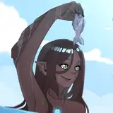
Today, I tried this approach with the color blue. This composition is inspired by the little bird in the reference photo known as the "Blue-footed Booby" (Sula nebouxii), a marine bird recognized for its distinctive bright blue feet, a trait chosen through sexual selection.
For a while, I've been interested in designing a character inspired by linemen, the professionals who work on telecommunication lines, including phone and internet cables.
The way I approach color and value distribution in this character design and illustration is mostly a combination of the techniques we discussed today and the ones I've been trying these past weeks. I select a dominant value and color, white and blue in this case. The largest shapes in the composition are predominantly these two - white and blue, with smaller shapes representing the opposite and complementary colors - black and red/orange. Although the entire uniform is white, the shadows are blue, thereby maintaining the dominance of the blue palette in some way. At first glance, you might see various shades of blue, and even a hint of green among others, but this is merely an illusion caused by the lighting. Once you check the PSD (available tomorrow), you'll see that the local color, or the base color, is practically blue.
I've been trying this approach organically for a while, but it's only recently that I've become more educated about it. I'll apply some of these suggestions frequently and see how strong the reaction in people is. The best way to master something is through repetition, so if you feel a bit of impostor syndrome, don't worry. It makes sense you're still not as sophisticated as you could be.
Conclusion
This is not a rule but a tendency. Different people can have different reactions to color and visual complexity. Some might be more attracted and emotionally connected to images with richer color and value variations. So it's also about personal preference and sensitivity.
So, are you into simple palettes or complex palettes? Try some of these theories in your sketches and feel free to drop your art + personal experience in the Discord chat. I'm very interested in knowing if there are more people like me and if this is actually a thing.
In case you're a Guillermo's fan too, you can read more about his approach to color in this article: https://www.studiobinder.com/blog/mastering-film-color-palette-del-toro/
Tomorrow, I'll share the process video, file, and further insights related to The Lineman artwork. These resources will be available for the Mastering Maestro tier and above. If this piques your interest, feel free to upgrade!
A warm welcome to all new patrons! Please feel free to pose any questions here in the comments, via DMs on Patreon, or in our Discord group. I'll be more than glad to assist and track your progress.
If you found this article useful, leave a like or a comment! I value your feedback and criticism as they help me improve and deliver the best to you.
For additional information, visit our Patreon FAQ: https://ramonn90.myportfolio.com/faq and Patreon Catalogue: https://ramonn90.myportfolio.com/work
Your support brings this content to life! Thank you.
Ramon Nuñez
2023-07-12 06:40:26 +0000 UTCAJ(@ILLUINTAGE)
2023-07-12 06:29:15 +0000 UTC