Hey everyone!
Continuing with what we were discussing in yesterday's post about "Steps Towards Original Art," during this process, you will find insights about my approach to using references to create original ideas, guiding the way from using references beyond just studies.
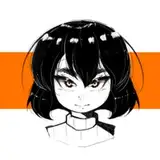
Bird Character
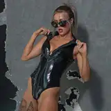
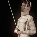
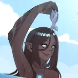
The most extreme case was the angel/devil character, in which I primarily used the pose and fabric texture as a base, then I explored the expression and proportions of the character's anatomy. As you can see in the video, I tried to replicate the proportions of the guy sitting in the suit, but something felt off, and I didn't know what it was. Because it was very late in that part of the process, I decided to continue the next day.
Once I reopened the canvas, I noticed the character wasn't stylized enough; the proportions were too normal and a bit rounded. Originally, I wasn't thinking of attaching an extra concept beyond the bird, so I thought about using the elegant outfit as an excuse to push a masculine, surreal idea of an angel/devil.
I searched for some extra references for characters with a very attractive appeal and a kind of dangerous nature. This led me to reshape the drawing into a more square-oriented facial structure (not rounded). Also, I made the shoulders wider and the extremities, like arms and legs, longer. I was thinking of "Tuxedo Mask," a Sailor Moon character, who is very mysterious but elegant and charming. As a consequence, I ended up looking for characteristics that are very common in romantic novels. Suddenly, this character shifted from "boring" to "dangerously attractive." The wings and cage were a nice touch to push perspective; the work done in the character's anatomy really caught the attention of some people in the comments, haha.
Cobra Character
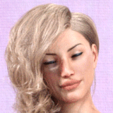
This cobra pic had been in my ref for a while, but I wasn't sure how I could capture its essence. Facial expression wasn't the answer, and neither was color. But I noticed a reference of a girl using her jacket in an interesting way. It wasn't exactly the shape of the cobra, but it kind of reminded me of the silhouette. Fair enough, I used the "shape" of the animal reference as the main structure and the white value for the composition of color.
From the reference of the girl in the jacket, I only used the pose and the fabric shape values. I made a small shift in the position of the face to make it more three-dimensional; the current face in the reference was fine, but in the drawing, it looked a little bit flat.
The Cobra Girl was basically the opposite of the Angel/Devil Guy in terms of values - he was dark, she was light. So, I made small changes in the saturation and tonality of the white values, so every shape would have a certain separation. For instance, the color of the skin is less white than the outfit, and the white in the hair is different from the outfit and skin. For me, it's important to have a little bit more information beyond plain white everywhere, so it doesn't look cheap or boring. As a last touch, I added some costume details and also tattoos that resemble the theme of this concept/character. Subtle and extra, but interesting.
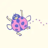
Frog Character
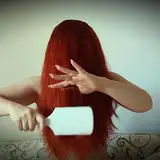
This was an old idea I drew a few weeks ago, but I didn't have enough time to finish it until yesterday. From the original animal reference, I found the contrast and the shape of this blue part of the frog changing size interesting. I'm not familiar with frog anatomy, so excuse me for not being more specific about what this part is. It kind of looked to me like headphones, and I'd saved the girl from the original reference a long time ago too. Basically, I do have a bunch of pictures saved, waiting for the proper time to be used, maybe in the right combination.
From the girl reference, again, I took the pose and fabric contrast values. What I like to do is simplify the number of colors and values to one or two, usually similar to the animal reference, and I blend these two ideas into one gently. This is an interesting way to approach references and create something "unique" or at least "original."
Feel free to check the files; I did make some changes with the filters, but only slight and simple ones. I'm currently trying to match this "end look" from the beginning of the process instead of with filters, but it's kind of tricky.
Conclusion
References are a support in your journey into building original ideas. You just need to know exactly what to extract from these sources. In my case, it's mostly fabric, but animals also serve as a guide.
.
Welcome to all new patrons! If you found this article useful, please drop a like or a comment! I appreciate the feedback and criticism as well, as I strive to improve and provide you with the best.
For more information, check out our Patreon FAQ: https://ramonn90.myportfolio.com/faq and Patreon Catalogue: https://ramonn90.myportfolio.com/work
Your support makes this content possible! Thank you.