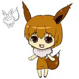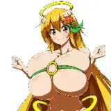
Hola a todos! como ya os dije aquí os voy a compartir trucos que yo uso, no sé si serán los mas correctos pero a mi me funcionan para hacer una ilustración o una página en este caso la pagina a color de Trizia que estará lista para este viernes (espero).Yo trabajo muy sencillo y aquí os voy a dar mi "receta" de como elaboro mis "platos" :P . Empecemos:
1. La línea
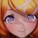
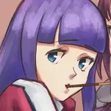
Yo lo que hago normalmente es "quemarla" un poco, es decir, con los niveles de Photoshop Ctrl+B (Equilibrio de color) voy jugando con el tono rojo y amarillo hasta conseguir un tono marrón mas o menos como el que veis, los ojos lo que hago es para que resalten con el control de niveles en ajustes ,los selecciono y le doy a la opción Blanco y negro y ahi los nivelo, una vez tengamos lista nuestra linea estaremos listos para colorear.
2.El Color.
Aquí es la parte mas sencilla, como veis el color es plano, es decir sin ningún tipo de sombras o matices (quizás algún degradado,pero poco más) esto se le conoce como los flats que es color base y os confieso que es la parte mas larga y tediosa del proceso yo me lo paso mejor con las sombras y los brillos,texturas, etc... como veis esta es la parte mas sencilla no tiene mucha complicación.
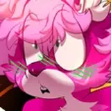
3.Las sombras.
En esta parte como veis (en la foto están el orden de los niveles y donde los ubico para trabajarlos) vemos las sombras, yo las pongo en multiplicar y normalmente selecciono la capa de color y ahi las aplico, a veces suele sobresalir fuera de la linea pero es como cuando echas mantequilla a las galletas y sobra por los bordes, con quitarlas con el borrador solucionado. a menudo suelo coger el color base y aplicarlo en las sombras multiplicando y ya te da el tono pero otras veces hay que buscarlo en los swatches que tienes en el Photoshop y aplicar el que mas le convenga o te guste en tu dibujo.
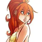
4.Los Brillos.
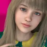
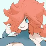
Aquí puedes hacer varias cosas: para darles volumen a las mejillas por ejemplo yo suelo coger con el cuentagotas la capa de color base y quitarle tonos y seleccionando la capa aplicarle el tono elegido con el aerógrafo así vemos si nos fijamos en la cara o el pecho de Trizia el tono de piel es mas claro que en su cara por la parte de abajo por ejemplo, es un cambio leve pero esto es opcional, o depende también del estilo de tu dibujo, etc...yo suelo ponerle puntitos blancos, esto se lo pillé a la colorista de Barbucci (dibujante que me encanta) y la verdad suele quedar muy bien Sarah con Hache en Sasi también suele hacerlo y al verdad es que le queda genial, aquí os explico el truco que uso yo para cristales de gafas u otro cristal ya sea de una ventana, un vaso, etc..y es en una capa pintar de blanco donde estará el cristal en cuestión y acto seguido en opacidad irle bajando hasta lograr dejarlo transparente luego en otra capa encima añades los brillos reflectantes eso no hace que los quites opacidad,puedes difuminarlos un poco , para darles mas realismo como se pueden apreciar en las gafas de Olivia.
5. La Máscara
O así al menos lo llamo yo para entenderme, es una capa de blanco que pongo justo encima de todo el dibujo y reduciéndole opacidad y relleno lo dejas como menos saturado, esto es opcional, yo lo uso y la verdad en la impresión el resultado es muy bueno pero no os paséis mucho u os saldrán como con neblina, yo suelo darle una opacidad del 70% y de relleno unos 30% mas o menos, luego le añades el fondo que tengas, en este caso el azul del cielo y listo, ya tienes tu dibujo.
Bueno estos son los cinco sencillos pasos que yo uso, espero hayan sido de vuestro agrado y os sirvan de ayuda, si tenéis alguna duda o alguna pregunta no dudéis en ponerlo en comentarios que yo lo estaré leyendo y en mi medida de lo posible os puedo ayudar a que vuestro dibujo sea mas chulo de lo que ya lo son :) un abrazo y nos vemos en el proximo post. :)
Hello everyone! As I told you here I am going to share tricks that I use, I do not know if they will be the most correct but they work for me to make an illustration or a page in this case the color page of Trizia that will be ready for this Friday (I hope ) .I work very simple and here I will give you my "recipe" of how I prepare my "dishes" : P. Let's start:
1. The line
What I usually do is "burn it" a bit, that is, with the levels of Photoshop Ctrl + B (Color Balance) I play with the red and yellow tone until I get a brown tone more or less like the one you see, the eyes what I do is to make them stand out with the level control in settings, I select them and give the option Black and white and there I level them, once we have our line ready we will be ready to color.
2.The Color.
Here is the simplest part, as you can see the color is flat, that is to say without any shadows or shades (maybe some gradient, but little else) this is known as the flats that is base color and I confess that it is the part Longer and tedious of the process I have a better time with shadows and brightness, textures, etc ... as you can see this is the simplest part, it doesn't have much complication.
3.The shadows.
In this part as you see (in the photo are the order of the levels and where I place them to work them) we see the shadows, I put them in multiply and I usually select the color layer and there I apply them, sometimes it stands out outside the line but it is like when you put marmalade on the cookies and left over by the edges, with removing them with the eraser solved. I often take the base color and apply it in the shadows multiplying and it already gives you the tone but other times you have to look for it in the swatches that you have in Photoshop and apply the one that suits you or you like in your drawing.
4.The Shines.
Here you can do several things: to give volume to the cheeks for example I usually take the base color layer with the eyedropper and remove tones and selecting the layer apply the chosen tone with the airbrush so we see if we look at the face or chest of Trizia the skin tone is lighter than on his face at the bottom for example, it is a slight change but this is optional, or it also depends on the style of your drawing, etc ... I usually put white dots, this I caught it to the colorist of Barbucci (cartoonist that I love) and the truth is usually very good Sarah with Hache in Sasi also usually does it and the truth is that it looks great, here I explain the trick that I use for glasses glasses or another glass either of a window, a glass, etc. and it is in a layer of white paint where the glass will be and then in opacity go down until it is able to leave it transparent then in another layer above you add the reflective glare that does not make Remove opacity, you can blur them a bit, to give them more realism as you can see in Olivia's glasses.
5. The Mask
Or so at least I call it to understand myself, it is a white layer that I put just above the whole drawing and reducing opacity and filling you leave it as less saturated, this is optional, I use it and the truth in printing the result is very good but do not spend much time or they will come out as if it were foggy, I usually give it an opacity of 70% and fill 30% or so, then you add the background you have, in this case the sky blue and voila, You already have your drawing.
Well these are the five simple steps that I use, I hope they have been to your liking and they help you, if you have any questions or questions do not hesitate to put it in comments that I will be reading and as far as possible I can help your drawing be cooler than they already are :) a hug and see you in the next post. :)
Pedro Perez
2019-08-30 19:31:04 +0000 UTCSaraH con Hache
2019-08-30 10:01:22 +0000 UTCPedro Perez
2019-08-29 21:01:24 +0000 UTCElangelquefue
2019-08-29 18:51:22 +0000 UTCPedro Perez
2019-08-29 16:08:26 +0000 UTCPedro Perez
2019-08-29 16:04:11 +0000 UTCSheila Havzi Art
2019-08-29 14:33:51 +0000 UTCElangelquefue
2019-08-29 14:29:21 +0000 UTC