Hello!
During this process, you'll notice that I changed the entire illustration after I was 80% done. Here's why:
Problem
This painting was created in two days. During the first day, I was in the middle of a tough situation. I don't usually share specifics, but sometimes life throws an extra dose of chaos your way, and if you're not prepared, it can hit you hard. Nevertheless, I tried my best with this painting during that period. At the end of the day, I was okay with the outcome, but something still felt off, so I went to sleep hoping to find a solution the next day.
Drawing
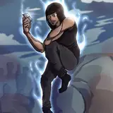
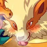
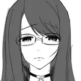
After a few hours of rest, I returned to the painting and went straight to the line art. I noticed the head was too big compared to the body - a common issue when you're pushing perspective. I spent a few minutes adjusting the proportions and considering the overall concept for Kari (the character).
Values and Colors
Once I had adjusted the lines, I went back to the beginning in terms of colors and values. I hate to waste my time, and I'm sure you can relate. What's interesting is that sometimes second chances can be quicker, as it's like walking down a road you already know. It doesn't necessarily yield a better result, but it's definitely faster.
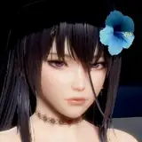
The approach for this piece was different. Although the fabric provides contrast, the main attraction in this piece is the face. Lately, I've been less focused on rendering faces and more on full-body compositions where the face is just an added element. In this case, the face is almost the main character. That's why "eyes" and subtle values are very important to build an interesting, yet subtly detailed composition.
I often don't stray far from the original reference colors until I feel the piece is a fair resemblance of the reference, aside from the character's unique characteristics like hair color, eye color, and skin color. Once I manage to match reality, I modify the local color and some values, being careful not to unbalance the composition with distracting colors. In this case, the mood was somber, black/white, kind of elegant, so strong saturated colors are confined to small shapes, unless the intention is different.
Details
Kari is an old character I've designed, which helps when it comes to customizing small details in the design or composition. This is a hint that she's a real person in continuity with what I've previously shown of her profile - a strong volleyball team leader and student. Please find more small insights in the file, especially about the filter and lighting treatment used to achieve this pink illumination mood.
Conclusion
If you're having a bad day, you can either stop or do what you can with the little strength you have. Be aware that today, you might not get the best outcome, and that's fine. Sometimes it has to be like this. Just don't skip your meals and your sleep hours. Bring some fresh air to your brain and go back to the fight the next day. Once you achieve stability, don't let yourself get floppy; stay hungry, stay aware, and stay prepared.
.
I would love your feedback (both positive and negative) so I can improve my content for you. Please leave a like or a comment if you found this article useful.
Welcome to all our new Patrons! If you have any questions, feel free to DM me here or on Discord.
For more information, check out our Patreon FAQ: https://ramonn90.myportfolio.com/faq and Patreon Catalog: https://ramonn90.myportfolio.com/work
Thank you for your support!
Ramon Nuñez
2023-06-22 06:32:52 +0000 UTCCarbon Remix
2023-06-21 18:12:21 +0000 UTC