Hello Hello!
This process is particularly interesting because I approached the conceptual and technical aspects in a different way. To make things easy for you, this article will be divided into "Concept" and "Technique" sections. Feel free to skip to each phase depending on your interest. Let's dive in!
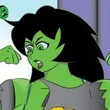
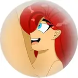
I didn't start with the "moon" topic as a main goal from the beginning. I wanted to address the second application of the "cube" theory over these next series, and for a common concept for several characters, I thought "blue" would be a nice subject. However, since I liked the first one so much, I decided to spend more time working on visual guides for you to understand the visual idea behind this cube theory. Nevertheless, here are some nice insights while creating the moon character iteration.
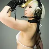
Because I'm trying to make several characters instead of one, I'm constantly searching for references that cover at least one point on my list of goals. If you have been checking the fashion reference board, you will find pretty pictures there, including the one I used this time. That covers:
I'm often looking for more points than the three previously mentioned, but it's not always the case that you can find several qualities in one picture, so I'd rather choose one that I'm sure would be a challenge to replicate from imagination.
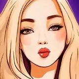
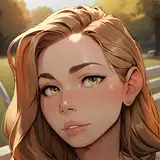
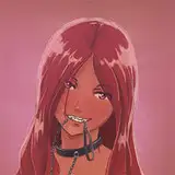
Through the process, new ideas often pop out that eventually change the concept of the character. My initial goal was simple: to attach blue as a main concept and make at least four characters with variations of black and white outfits, but predominantly blue.
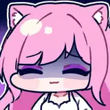
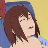
The moon idea popped up after I started to add details to the outfit, like the little clouds on the sweater. I asked my girlfriend to help me with some accessories, like pins, and she sent me a "moon" pin that said "just a phase". One thing led to the other, and I added some extra details that suggested this resemblance with the moon. I was very lucky that the parachute allowed me to add a little unrealistic shadow on top of her face, making this small illusion of the moon phase in the reference, along with some other extra details.
I've noticed that choosing a very simple theme gives you certain freedom to attach any kind of concept, and by simple, I mean a color. Color is basically everywhere. So, I'll try this color challenge again for the next post. Wait for it.
Drawing: If you read the past article, you will know by now that I don't use guides at the beginning of the process, it's mostly intuitive at this point. In the minute 12:20 of the process video, you will see I quickly check the proportions by making the cube trick on top of the sketch. It is very fast since I did not feel the anatomy was off, but it's important to push this double-check grid because sometimes if you spend too much time looking at the piece of art, you tend to miss mistakes. That's why artists often spend several days on one piece, because your brain needs to rest and then go back with a fresh approach to spot things off.
There are several tricks you can do if you don't want or can't wait for days to finish, like the cube trick, flipping the canvas, or making the picture very small, but nothing beats stopping for at least 1 hour to efficiently spot the mistakes.
Values: I did not start with colors like I used to, this process was oriented towards proper values at first. I've noticed that sometimes I neglected a value correction until the end, and the next day when I check the piece with fresh eyes it looks bland, no contrast, no strength. So, this time I decided to make a separation between shapes, choosing a few values that belong to three categories:
How do we define what value belongs to each category? Let's use the HSB Sliders in the Photoshop Color window!.
If you don't have this window active, do this: In your Photoshop, search right at the top for the "windows" button, scroll and activate the "color" option. This will show the color window.
In the color window, at the right in the four-line small button, click and select the "HSB Sliders". This will show you three options: Hue, Saturation, and Brightness.
In the brightness tab, you will notice it goes from black to white, with black represented by 0% and White as 100%. Split the tab into three value tones:
While this is not strictly necessary, it would give you a fair guide on how the values of the character composition are distributed. I'll recommend you to cover these three categories by choosing a balanced composition. For instance, cloth with three tones (shirt bright, pants mid, shoes dark), or maybe cloth that belongs to one value tone with small variations, but the skin belongs to a different tone, and you have accessories that also belong to a different tone.
Value composition is important to create interesting information for the viewer to read in your character. I'll recommend you to distribute them in different portions like maybe the mid-value will cover 50% of the body, bright value 30% and dark 20%, so you don't overwhelm the viewer with the same amount of information. A hierarchy of values in this matter makes the piece easier to read, but at the end of the day, these rules can bend depending on the goal. I've made character compositions all with bright values, just for the sake of a concept. Feel free to explore.
On top of that, you can make shadows and lights, the extra values that are oriented towards creating volume.
Colors: Particularly in this case, I just selected a few layers already defined and I added a very simple palette, with variations of blue. This blue is often used at the beginning for local color but eventually, the blue ends up changing with filters like "selective color" that aim to blend desaturated tones towards a more bluish mood.
Shadows are also modified since at first, it was a grey tone, the colors of the shadows change depending on the local color, basically a darker version of what the local color is.
Details: The bag render at first was "ok", but after I added colors to the overall character I tried to push realism in terms of values as much as I can, and I'm very happy to see all I did with only one value in the same layer, just using hard and soft edges. This is a very interesting approach I highly recommend in terms of efficiency. It's not easy but definitely a great way to master reality with simplicity.
I did not record the last details like the owl, for instance, since I felt that the value of this process was pretty much captured at the beginning of the process, but if you have any doubt, please check the file to find the basic structure and drop any question. I'll reply as fast as I can.
Conclusion: Creating art is complex because it's an attempt to encapsulate your life experiences and reality, which is already saturated with information, resembling an endlessly intricate game. It doesn't really matter how you start, as long as you have some goals in mind or a direction. It could be as simple as choosing a color, or anything else. Just begin, and the journey will present you with ideas you wouldn't find any other way. So stay aware and don't be afraid!
This process is one small step among many more iterations. My aim is to explore both technically and conceptually as much as possible, in order to improve my skills and equip you with tools to discover your own journey. I welcome your feedback, both positive and negative, as it helps me refine the content I create for you. Please leave a like or a comment if you found this article useful.
Welcome to all our new Patrons! If you have any questions, feel free to DM me here or on Discord.
For more information, check out our Patreon FAQ: https://ramonn90.myportfolio.com/faq and Patreon Catalog: https://ramonn90.myportfolio.com/work
I cannot stress this enough: your support makes it possible for me to create content like this. Thank you!