Hey guys!
What are you finding useful in this particular process?
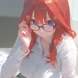
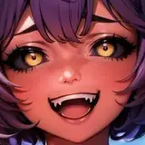
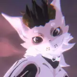
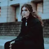
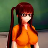
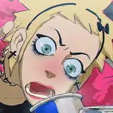
Cell + Color Burn
As you may have noticed, the render in these two pieces leans more towards the cell style, similar to animation, but slightly more complex since I'm adding an extra "color burn" shadow right on the edge of the shadow shape. This small touch pumps up the shapes a bit more, making them look more realistic. If you're interested in pushing this technique further towards a more realistic end, just use the soft brush to smudge shadow edges while rendering them.
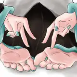
Line Art Occlusion Shadows
In simple terms, "occlusion shadows" are the tiny dark spots you see in corners or where objects touch each other, created because light can't reach these areas. I often neglect these small details while drawing because pure black tends to bother me when I also have other different value shadows. I like to use pure black when there are no other shadows, similar to the Mike Mignola style - just black and colors. But since the little black shadow shapes were small this time, I wanted to give it a try. Occlusion Shadows help to give drawings a sense of depth and realism.
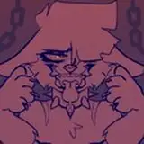
Saturated Shadows
I often recommend trying unsaturated warm shadows, but the information in these two pieces was related to color, so I was focused on splitting the complexity between line art and colors. To pump up the mood, I decided to assign a similar tonality to the shadow color. Notice how I keep the tone but make the shadow brighter where the local color is a bit more white. This helps to differentiate between shapes that do not share the same values.
Conclusion
Balancing an illustration can be a challenge if you have too many goals in mind. Notice how I kept the shadow render as simple as I could and placed a heavier weight on the line art information. This allowed me to spend more time finding an interesting palette combination without distractions. So, keep it simple.
This is a very practical technique if you're struggling with palette balance. If you love to add several different colors into your composition, it's useful to first master a few. The combination is an essential part of harmony and mood, not only in character design but in art in general. Stay tuned for more exercises of this nature.
.
Welcome to all new patrons. Feel free to ask any question via DMs here on Patreon, or in our Discord group. I usually reply in less than 24 hours!
I appreciate the feedback and also criticism. I want to improve and give you the very best, so if you found this article useful, please drop a like or a comment.
For more information, check out our Patreon FAQ: https://ramonn90.myportfolio.com/faq and Patreon Catalogue: https://ramonn90.myportfolio.com/work
Your support makes it possible for me to create this kind of content. Thank you!