Hey everyone!
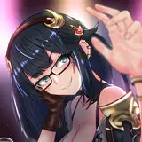
In this article, I'll guide you through the creation of my 'Lineman' illustration, which blends features from the Booby bird and the linemen profession. I'll be diving into both the conceptual and technical aspects of the process, particularly emphasizing a simple tip for incorporating character-environment interaction for storytelling. Also, I'll be discussing the interplay of color, including my rationale behind choosing certain shades and tones, and how they contribute to the overall composition. If this content aids you in any way, your engagement and feedback would be greatly appreciated. Enjoy!
Concept
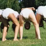
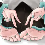
The simple idea with which I started the process for this illustration was a character holding a phone. This bird with blue feet has been in my reference folder for a while, but I hadn't thought of an interesting way to present a concept. Since a character with blue boots might be the obvious choice, after I found this reference with the Booby bringing his feet to his face, I thought the "gloves" idea would be original enough.
To make it a bit more interesting and unique, I combined it with the lineman profession as an excuse to create a situation in which the character is actually working. This is something I generally like my characters or illustrations to have, a sense of action or meaning.
Sketch
In the first few minutes, you will notice how the rough structure of the composition resembles the situation through his hands; he is working towards something. Although one hand holding the phone and the other actually touching the cables would resemble the reference more, I thought both hands on the "front layer" would enhance the sense of depth in the composition. I also like to distort hands because of perspective.
Check this post for context related to layer hierarchy in composition and perspective https://www.patreon.com/posts/capturing-energy-85556876. As you know, splitting the layers in the composition creates a sense of depth.
Tip about Interaction
The little pigeon in the front layer adds a bit of interactive touch to the situation, bringing more life into the scene. If you are working towards "storytelling" in your art, try to think about how your character can interact with its surroundings.
Perhaps make a list of possible reactions (scared, confused, happy, sad) and play with the composition to position possible triggers, like the pigeon in this case. To bootstrap some ideas, once you have a rough sketch of the character's action, start working on the face for the eyebrows and the position of the pupils. Some good ideas might pop up that direct the viewer's attention towards whatever the character is looking at.
At some point, I was struggling with the position of the head in relation to the shoulders. Sometimes you can't even grasp what's off in the anatomy, so I've tried the "cube" approach to adjust the anatomy. If you are new around here, you will find more specifics about this technique at https://www.patreon.com/posts/anatomy-meets-2-84952708.
Colors
As I mentioned in yesterday's post, the color/values distribution was predominantly white and blue. I did start adding some forms of brown dark tones in a few shapes like the hair and t-shirt, but I quickly turned them into darker and more desaturated tones. I quite prefer them this way because they are less distracting for me.
I've changed the tone of the outfit equipment from blue to orange and then to brown to add a complementary color that could contrast the dominant blue. I was careful to keep this new tone under a desaturated level in order to maintain relevance in the blue of the gloves and phone. Too much saturation in the secondary color might also be distracting.
Also, I've made the shadow blue since it would cover a large part of the body, and I've noticed that shadows on white shapes often are cold, so it was perfect.
Values
For lighting, I've chosen a top-left projection towards the character since I assume it was daylight, and the arm looked exposed enough to project interesting shapes in the fabric caused by the contrast between light and shadow. Notice how I also try to create this contrast in other parts of the body (torso) but softly since I already have enough information with shapes like equipment, t-shirt, cables, and uniform sections.
Details
As an extra touch, the hair, tattoos, and even the hidden brand of the linemen "Galapago's Lineman" were a mix of information related to the bird, the profession, and a bit of my "badass style" (tattoos). Initially, I created some tension lines on top of the whole composition (you will see it in the video), but they were covering some parts of the character that I considered important, so I guess I could push this idea a bit more, but it was not necessary.
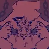
I've also created a little short story as an extra picture because why not add a bit of context? Ideally, I would also draw that, but maybe next time.
Conclusion
The sketch phase is when I figure out if many of my previous ideas actually look interesting on the canvas. It's also where new ideas pop up, like the interaction between the character and the environment. So keep in mind that colors and values are key, but they often reinforce a core idea. So don't worry about what your color palette would be, what the right illumination you should have, or even the number of details you will add until you feel comfortable with your initial sketch.
Many of the decisions described in this post are made spontaneously through the process without careful thought. This structured description is made after I do a self-reflection of the process and is presented in a way that is easy to comprehend (I assume) for you. But please, if you have any question or feedback, drop it in the comments, or just let me know privately or on Discord.
Please check the PSD for more insights about the filter treatment in this piece. You will notice a substantial change when turning these filters off, mostly to recognize the level of saturation and values I use during the process and how I adjust them once I'm 80% done with the piece.
Welcome to all new patrons! If you found this article useful, please drop a like or a comment! I appreciate the feedback and criticism as well, as I strive to improve and provide you with the best.
For more information, check out our Patreon FAQ: https://ramonn90.myportfolio.com/faq and Patreon Catalogue: https://ramonn90.myportfolio.com/work
Your support makes this content possible! Thank you.
Ramon Nuñez
2023-07-12 17:03:52 +0000 UTCkyezzzz
2023-07-12 16:47:08 +0000 UTC