Hey Everyone!
I've noticed that some of you are struggling to find the right combination of brushes to use from my set. That makes sense since we have around 400+ brushes, but you'll soon notice that I mostly use 5. The rest are extras for very particular textures I use from time to time.
So today, let's talk about expressiveness and dynamism through brushes and which of the brushes in my set can help you address this vital part of the creative process.
A common challenge faced by both novice and experienced digital artists is adding expressiveness and dynamism to their line work. Often, drawings can feel flat, rigid, or lacking in life, leading to artwork that fails to fully captivate or engage viewers. The issue isn't just about creating an aesthetically pleasing image; it's about communicating emotion, action, and intention. Expressive line work can significantly enhance the narrative and emotional depth of your artwork. Therefore, mastering this skill can elevate your artwork from good to truly compelling.
Why Is Expressive Line Work Important?
Line work is the skeleton of your art; it provides structure but can also convey so much more. It's not just about outlining shapes or detailing features; it's a powerful tool that can express emotion, indicate movement, and guide the viewer's eyes. By varying line attributes like weight, direction, and curvature, you can make your artwork feel more dynamic and engaging, and tell a story beyond the colors and shapes.
Tips for Expressive Line Work
1. Varying Line Weight: A uniform line weight can often make a drawing appear flat. By varying your line weight—using thicker lines for areas in shadow or parts of the object that are closer to the viewer, and thinner lines for areas in light or parts that are further away—you can create a sense of depth and volume in your drawings. This strategy can also help emphasize specific parts of your drawing, directing the viewer's focus.
My favorite brush is "Pencil Oh". This one changes the weight depending on how you pressure the stroke. The less pressure, the smaller it becomes. But if you want to try a brush that has more weight range and strength, I recommend one called "Kyle's Manga - Basic". I'm not sure if it's currently included in my set, but if not, check for Kyle's brushes on Gumroad. He is a legend.
2. Playing with Line Quality: Line quality refers to the characteristic of the line such as smooth, rough, broken, etc. Rough, jagged lines can suggest tension, action, or chaos, while smooth, flowing lines can convey calm, elegance, or grace. Experiment with different brush settings or stylus techniques to achieve different line qualities and evoke specific moods or emotions.
For smooth line art, I sometimes use a brush called "Clean". For rough line art, I prefer "Pencil Oh" because of its texture—it looks like a traditional pencil.
3. Line Direction & Gesture: The direction of your lines can dramatically impact the perceived movement and flow of your artwork. Curved lines can imply softness, movement, or growth, while straight lines often suggest stability or rigidity. Gesture lines, which are quick, sweeping lines that capture the motion of the subject, can imbue your drawing with a sense of life and energy.
As I've mentioned in past articles, I usually start illustrations by exploring with curves. The best brush for this, in my opinion, is "Pencil Oh". But if you want strong shapes, I recommend "Limberto", which is the brush I use for shadows at the beginning. It's a bit too strong, but efficient.
4. Crosshatching and Line Spacing: Crosshatching, or the use of intersecting lines, is a classic technique for creating a sense of depth and shadow. By varying the density and direction of your lines, you can create a range of values and suggest the contours of your subject. Spacing lines further apart can imply a lighter value, while bringing them closer together can indicate a darker area.
I often make my shadows directly with one brush, but if you want to try crosshatching, there is a brush in my set called "Farba 2". It's an interesting brush that has a stroke shape that defines a line and also a soft gradient. Depending on the direction of your stroke, the gradient changes position. It resembles pretty much the look of a traditional pencil, which I think fits with the crosshatching goal.
Conclusion
Line work is an essential part of digital art that often gets overlooked. Remember, lines are not just boundaries, but a medium to express your creative voice. By incorporating these techniques into your practice, you can create digital illustrations that are lively, compelling, and full of depth. And remember, like any skill, expressive line work takes time to master, but with persistence, your efforts will lead to powerful results.
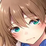
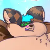
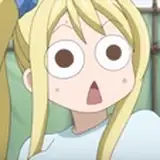
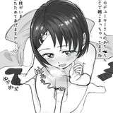
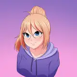
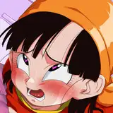
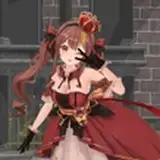
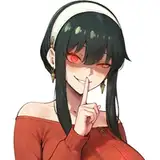
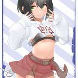
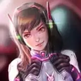
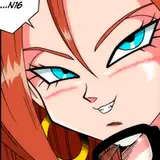
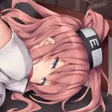
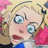
If you still have any doubt, I'll attach pictures with each brush for you to find them and try, but nevertheless, hit me with any question and I'll be more than happy to help.
Tomorrow, I'll share more about this process along with the PSD and Process video in which I'll explain the process behind this piece. It's available for everyone in the 'Mastering Maestro' tier and above. If this tickles your fancy, feel free to upgrade ;)
Welcome to all new patrons! Feel free to ask any questions here in the comments, via DMs on Patreon, or in our Discord group. I'm here to help.
For additional information, visit our Patreon FAQ: https://ramonn90.myportfolio.com/faq and Patreon Catalogue: https://ramonn90.myportfolio.com/work
This content is possible thanks to your support!
Mark
2023-10-30 19:15:41 +0000 UTC雷雪 邓
2023-07-26 03:57:07 +0000 UTCRamon Nuñez
2023-07-22 04:53:04 +0000 UTC