Hey everyone!
In this process, you'll see how I initially focused on creating a shape differentiation between the two characters. This was with the goal of capturing the energy each lovebird had in the original reference and also to push the concept as clearly as I could using gesture.
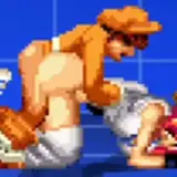
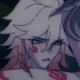
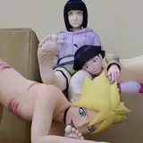
At first, you'll notice my idea for the male character was directed towards a "military" theme. You can deduce this from the many pockets and haircut. The reason behind this was because I was aiming for the most serious character I could come up with. The military guy was my first shot; even a police character would have sufficed. However, this direction changed later since it didn't quite harmonize with the female character. I'll explain more on this later.
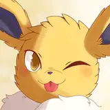
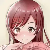
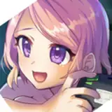
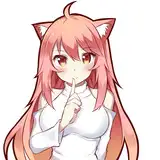
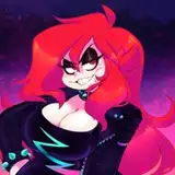
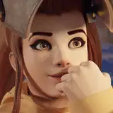
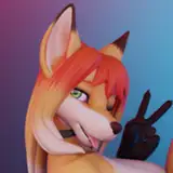
When creating the female character, I prioritized body structure and gesture over intricate details. I aimed to capture the dance movement as simply as I could, bearing in mind that adding colors, values, and other details would be challenging. My approach to such animation tasks is to pick one key frame as a starting point, often drawing inspiration from the original reference. Then, I attempt another with an entirely different gesture, inspired again by the reference. These two, and sometimes even three, key frames serve as a foundation for other frames that act as variations of the initial ones. To generate additional frames from the key ones, I duplicate those I deem necessary and make slight modifications, often using ctrl-t and warp. This will be clearer in the video.
Where do I typically add more frames beyond the key ones? Mostly where the movement of the reference (in this case, the bird's body) decelerates. For example, if the bird is spinning its head, note which part of the spin slows down and which accelerates. As I plan to reproduce that "slow down" frame in the character, I want to avoid a static frame during that phase. So, I often duplicate the frame representing that moment and tweak it to maintain the motion. Here's a quick video that delves deeper into these secondary frames, known as "inbetweens". They're frequently used in animation to smoothen the movement: YouTube Link.
After crafting a dance movement in the female character akin to the reference, I moved on to refining each character and adding details.
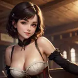
As I mentioned earlier, I initially thought an intriguing contrast would be to depict both characters with stern professional backgrounds, like military or police personnel. However, this tone wasn't fitting for the female character, and I felt a more relatable portrayal might resonate better with audiences. Thus, I opted to depict them as teenagers, reminiscent of an American/Latino high school couple.
I sourced some character inspirations from Slam Dunk. I'm uncertain why, but the aura I envisioned for the male character was that of a tall, masculine adolescent and his potential girlfriend or friend. My mind did wander to a sports-themed context, but I didn't expand on this beyond their anatomies. I've contemplated exploring sports themes more intensively, so I might venture there next week.
I settled on casual and straightforward outfits for both characters, intending for the animation to remain the focal point, complemented by a detailed render of their attire. Maintaining this balance is crucial for me to invest energy where I'm most passionate. I could potentially enhance the character design details in conjunction with the animation, but I'll reserve that endeavor for when I feel more adept at crafting concise yet impactful animations.
During this animation round, my procedure was slightly more organized. If you inspect the process video, you'll observe that I dedicated extra time to neaten the lines, streamlining the subsequent painting phase. It's remarkable how much time tidy line art can conserve.
The painting approach was largely consistent with my recent practices, though simplified since I incorporated only the essentials. It's fair to acknowledge that I enjoyed this week's animation challenge. I garnered a decent number of impressions on X (Twitter) and IG, which surpassed what I would've achieved with static illustrations alone.
Conclusion
Although this process was somewhat more demanding than pure illustration, delving into intricate designs is time-consuming for me. With simpler designs, the movement itself garners attention, especially if the subject is engaging or relatable. I'm eager to experiment more with this approach in upcoming projects. For now, I reckon it's time to revert to pure illustration.
.
Welcome to all new patrons! Feel free to ask any questions here in the comments, via DMs on Patreon, or in our Discord group. I'm eager to help and witness your growth.
For more information, check out our Patreon FAQ: https://ramonn90.myportfolio.com/faq and Patreon Catalogue: https://ramonn90.myportfolio.com/work
Your support makes this content possible, thank you