■ はじめに – ちょっとした小話を
いつもご覧いただき、本当にありがとうございます🙇♀️
今回は少し趣向を変えて、画風の使い分けについて、こっそり語ってみようかなと。
本来ならXで話してもいい内容かもしれませんが、「絵師の真似事をするな!」と怒られたことがあるので、ここで静かに綴りますね…。
⸻
■ 二つの画風、それぞれの個性
最近の投稿をご覧いただいている方はお気づきかもしれません。
実は今、2種類の画風を使い分けています。
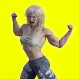
• ①癖のある線と塗り(サムネの一枚目)
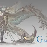
• ②透明感を重視した塗り(2枚目)
この②の透明感のある画風は、実は6月頃にすでに完成していました。
「引き算」を意識し、水の表現などが非常に綺麗なのですが、綺麗すぎるゆえに個性が弱く、背景とセットでないとインパクトに欠けてしまうことも。
チャットGPTからも「インパクトに弱い」とズバッと言われ、新しい表現を模索することに。そして生まれたのが、①の癖つよ画風です。
①はとにかく**「癖を出す」**ことがコンセプト。人を選ぶけれど、表現の幅は広く、特にお気に入り。ただし、身体や背景の質感に弱く、水着表現などでは少し物足りなさも。
⸻
■ メカ娘と画風の相性、そして“変える勇気”
面白い発見だったのが、癖つよ画風がメカ娘にすごく向いていたこと。
メカ娘って形が複雑で、羽根ひとつとっても均一に描けない難物。その点、癖のある画風は「ごちゃごちゃ感」を出してくれて、最初は混沌としてても、整えていくことで理想の表現に近づけることができます。
一方で透明感画風は、「綺麗だけどつまらない」になりがち。余計な装飾を排除するぶん、メカの魅力が削がれてしまうんです。
⸻
■ 最後に – 画風を巡る旅はこれからも
本来なら、画風は一貫していた方が良いのかもしれません。
でも、AIイラストの投稿サイクルはとても早い。
例えば:
• 1日3枚 × 3か月 = 約270枚
• 一般的な絵師の倍以上のペース
それだけ早く投稿していると、どうしても“見慣れ”は避けられません。
だからこそ、見てくれる方に新鮮な驚きや楽しさを感じてもらえるよう、常に表現をアップデートしていきたい。
そう思って、今日も画風を模索しながら描いています。
⸻
✨おわりに
読んでくださってありがとうございました!
感想などあれば、ぜひ気軽に教えていただけると嬉しいです🐇
🎨【On Using Different Art Styles – A Little Behind-the-Scenes Talk】
⸻
■ Introduction – A Small Creative Story
Thank you so much for always checking out my work! 🙇♀️
Today, I’d like to try something a little different and talk a bit about how I approach different art styles.
It’s the kind of thing I could probably post on X (formerly Twitter), but whenever I bring up topics like this, I sometimes get messages saying, “Stop pretending to be a real artist!” So I’m sharing it here quietly instead…
⸻
■ Two Styles, Two Personalities
Some of you may have already noticed:
Lately, I’ve been alternating between two different art styles.
• Style #1: Bold, stylized linework and coloring (like the first image thumbnail)
• Style #2: Soft, transparent coloring with a delicate, clean finish (like the second image)
Actually, I completed Style #2 around June. It’s all about minimalism—“subtracting” details to bring out transparency and purity, especially with water effects.
But because it’s so clean, it can feel a bit impersonal. It often relies heavily on the background to make an impact, and doesn’t always stand out depending on the subject.
Even ChatGPT told me outright:
“This style lacks impact.”
So I set off on a journey to develop something new.
Enter Style #1—designed with “quirkiness” in mind.
It’s more expressive, though admittedly more niche. I love how playful and unique it is.
But it has its drawbacks too: the skin and background textures don’t always come through well.
Especially in illustrations like swimsuits, where texture is key, it didn’t quite hit the mark.
⸻
■ A Surprise Discovery – Perfect for Mecha Girls!?
One happy accident:
I found that Style #1 works surprisingly well with mecha girls! 💥
Drawing them can be tricky—wings and shapes rarely align symmetrically, and they often look messy.
While Style #2 can handle mecha to some extent, its minimalist nature simplifies too much.
The result?
It’s beautiful—but also boring. It lacks that extra flair or sense of chaos that makes mecha designs exciting.
Style #1, on the other hand, thrives in complexity.
It lets me go wild with details, which I then carefully polish by hand. It’s exhausting—but also super rewarding.
So for now, I think this style is the best fit for my mecha girl illustrations.
⸻
■ Final Thoughts – Changing Styles Isn’t a Bad Thing
I know some may think that changing styles too often is a bad idea.
But when it comes to AI-generated illustrations, the pace is incredibly fast.
To give you an idea:
• 3 illustrations a day × 3 months = nearly 270 pieces
• That’s more than twice what a typical artist might post in a year
With so much volume, it’s only natural for viewers to get used to your work quickly.
That’s why I believe it’s important to keep evolving—to bring freshness and joy to those who support me.
⸻
✨Thank You!
Thanks for taking the time to read this long post!
If you have any thoughts or questions, I’d love to hear them. 🐇💬
バターサンド
2025-09-15 12:13:05 +0000 UTCうさぎ あいばの
2025-09-15 11:51:11 +0000 UTCバターサンド
2025-09-15 11:21:40 +0000 UTC