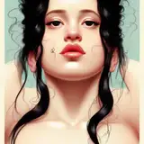
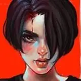
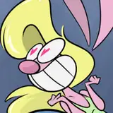
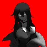
Help me by voting on what looks better please and thank you
Added 2020-08-06 20:10:45 +0000 UTC
So I've been using the style on the left for the last fucking however long and I'm really annoyed with myself for not experimenting more now, because I think the answer is incredibly obvious as to what looks better
Please lemme know below which style you like more, though I think it's pretty obvious
Right, brighter pic
Strumpf
2020-08-30 21:06:35 +0000 UTC
Man, really hard to say. Both look good honestly.
Silent One
2020-08-10 01:59:46 +0000 UTC
2nd
Aarongeddon
2020-08-09 22:47:24 +0000 UTC
before
2020-08-09 13:08:57 +0000 UTC
2nd
Jean-François Bédard
2020-08-08 16:31:26 +0000 UTC
am i the only one that prefers the “before” version
cam
2020-08-08 14:36:39 +0000 UTC
I like the 2nd one more than the first. I wouldn't mind seeing if some of the lining can be less thick on some parts though. I think the Ears on this one specifically benefit a lot from the outline, but the bottom seems a little dark.
Gk
2020-08-08 13:40:31 +0000 UTC
Oooh this is exciting! I love the new look
Paps
2020-08-08 05:32:26 +0000 UTC
Before
2020-08-08 02:24:51 +0000 UTC
I dig after a lil more
OmegaSimp
2020-08-07 23:20:03 +0000 UTC
after
2020-08-07 22:22:17 +0000 UTC
I prefer the before version if I'd have to pick one.
2020-08-07 20:32:15 +0000 UTC
I like very much the second one but the first still has something that make me like it in a different way, but the colors and the contrast with the outline of the second one make it looks more bright i think
KuroKnight01
2020-08-07 14:24:47 +0000 UTC
That looks great! I can't wait to see an animation with the new style of shading!
Jack Jagger
2020-08-07 12:40:16 +0000 UTC
after
HellSpawn
2020-08-07 11:53:49 +0000 UTC
After
Crystal Sipp
2020-08-07 11:14:08 +0000 UTC
The "after" does feel more like the show
Ramon O'Sionnach
2020-08-07 11:02:17 +0000 UTC
After is better :)
2020-08-07 11:02:00 +0000 UTC
After
Ikkiya
2020-08-07 10:49:39 +0000 UTC
Wouldn't it have been better to make a strawpoll?
JellyDonut
2020-08-07 08:27:47 +0000 UTC
After
Herbie
2020-08-07 07:14:25 +0000 UTC
after
Pancake
2020-08-07 06:16:13 +0000 UTC
before
2020-08-07 06:14:58 +0000 UTC
I love both but right is more cartoony, I think that's cooler
Zetsubo
2020-08-07 06:04:35 +0000 UTC
Righto daddio
HerpaDalio
2020-08-07 05:59:01 +0000 UTC
All the above
KingCrimson
2020-08-07 05:34:13 +0000 UTC
before
Chazzy
2020-08-07 04:21:31 +0000 UTC
Left
Xan
2020-08-07 03:43:42 +0000 UTC
I like the Before, but maybe the After could work for me better with similar shadowing like the Before
2020-08-07 02:31:44 +0000 UTC
After
Armallama
2020-08-07 02:20:50 +0000 UTC
Right
2020-08-07 02:15:50 +0000 UTC
After.
Ryan Carrillo
2020-08-07 01:50:53 +0000 UTC
Before looks more realistic to me so that's the one I prefer.
DeusInMachina
2020-08-07 01:48:45 +0000 UTC
After
Cat in a bed sleeping
2020-08-07 01:30:49 +0000 UTC
I love them both (but I'm bias as hell, Jirou is my favorite character), but I feel the one on the right is cuter
Flash Deku
2020-08-07 01:11:51 +0000 UTC
After
Anthony
2020-08-07 01:10:42 +0000 UTC
After
TenPin
2020-08-07 01:06:01 +0000 UTC
Styles can change and evolve and improve
Great M8
2020-08-07 01:01:28 +0000 UTC
left
Harryblum
2020-08-07 00:52:44 +0000 UTC
Right (the after side)
Eric P.
2020-08-07 00:24:39 +0000 UTC
The left side is always your style
織田 方
2020-08-07 00:19:34 +0000 UTC
I like the right
Ricardo
2020-08-07 00:12:20 +0000 UTC
The right side looks more like anime while the left is more 3d-looking. Both are good! I like the right, and I think it has less danger of veering into uncanny valley territory.
Mirumoto Tsubasa
2020-08-07 00:11:28 +0000 UTC
I'm going to say before.
Bean
2020-08-07 00:09:30 +0000 UTC
after
2020-08-06 23:56:01 +0000 UTC
Before
Daniel Turner
2020-08-06 23:45:20 +0000 UTC
Gotta say the right
Biostar
2020-08-06 23:43:01 +0000 UTC
After
Jorge Smith
2020-08-06 23:40:28 +0000 UTC
right
David Izzo
2020-08-06 23:34:40 +0000 UTC
The one on the right for me
Spectras
2020-08-06 23:09:15 +0000 UTC
Right! 100% for me!
Ellaria Gable
2020-08-06 22:55:52 +0000 UTC
i like the left because it looks smoother and thus animation looks smother but the right is a great for an image but id love to see that style in animation to make a final judgement
2020-08-06 22:49:07 +0000 UTC
I would have to see both in animation but I am agreeing with Chae on this one. THe left one looks move natural when moving but the right one is great while still though again I would need to see the right one animated to be sure.
Kaiyeti
2020-08-06 22:38:06 +0000 UTC
The after 100%.
AngryS
2020-08-06 22:35:57 +0000 UTC
For me definitely the “after”
Saif-999
2020-08-06 22:16:58 +0000 UTC
I prefer the right one though I agree with the other comments that an animation, even a short one would help.
Caustic Hornet
2020-08-06 22:09:26 +0000 UTC
Right, 100%
Alpha_Doom
2020-08-06 21:54:09 +0000 UTC
Both? Need to see an animation first
2020-08-06 21:52:38 +0000 UTC
I'd have to agree. From the still shot, there are pro's and con's to both: 1 - P: Softer colors & shadows / C: Edges can look blurry, 2 - P: Sharper edges and higher contrast / C: Shadows & 'natural' edges can give incorrect position/proportion due to being too sharp
vinny8boberano
2020-08-06 21:50:33 +0000 UTC
First (Left) one. Feels and looks way more like YOUR style than the right one.
Ronald Morrison
2020-08-06 21:49:17 +0000 UTC
right
enzo
2020-08-06 21:45:23 +0000 UTC
We'd have to see what the outline one looks like in motion tbh.
Apache
2020-08-06 21:42:53 +0000 UTC
I kinda like both
SharkMessiah101
2020-08-06 21:37:01 +0000 UTC
Right one
Emil Yi
2020-08-06 21:33:49 +0000 UTC
Left for animations right for posters/pinups
2020-08-06 21:28:46 +0000 UTC
Left one
LeoZiggy
2020-08-06 21:28:16 +0000 UTC
After, I'd say. Don't know about in motion.
Agentx
2020-08-06 21:28:03 +0000 UTC
I think the left for animations and the right for posters is nice since the outlines on the right one make it look more like the anime I think and the left looks more real. If I have to stick with just one then I would go for the before.
Monkeii
2020-08-06 21:20:16 +0000 UTC
The right one
2020-08-06 21:18:39 +0000 UTC
Right definitely
Afrokage
2020-08-06 21:15:21 +0000 UTC
Absolutely the newer one!
Kinky no Kyoukai
2020-08-06 21:12:19 +0000 UTC
leeeeeft
Leo
2020-08-06 21:07:51 +0000 UTC
I myself have always loved designs with outlines so the new version is better to me.
s0n1cb00m
2020-08-06 21:06:09 +0000 UTC
After 100 percent
Tyler
2020-08-06 21:04:09 +0000 UTC
right
2020-08-06 21:01:09 +0000 UTC
Left for me.
Michael L Blunt
2020-08-06 21:00:21 +0000 UTC
I say before
GrimOmen13
2020-08-06 20:57:10 +0000 UTC
Before, tbh
that stupid mf
2020-08-06 20:55:28 +0000 UTC
After 😍
Omorfia
2020-08-06 20:53:18 +0000 UTC
After for sure
jackerrør
2020-08-06 20:52:20 +0000 UTC
After
Silvers
2020-08-06 20:51:18 +0000 UTC
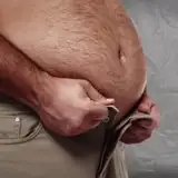
before for that sexy stomach
Red Kawa
2020-08-06 20:49:44 +0000 UTC
Both are greatM8, but I would choose after
Onetoughact
2020-08-06 20:48:40 +0000 UTC
Before is better imo.
2020-08-06 20:47:32 +0000 UTC
Personally, I like the after. It just makes more sense with that art style.
Nick BrianJerkedOffToPsylocke Ford
2020-08-06 20:47:01 +0000 UTC
The black lines make it so much better. If it isn't that much harder to do, i say switch it over.
Hunter Mackey
2020-08-06 20:46:51 +0000 UTC
i prefer the new style
2020-08-06 20:43:52 +0000 UTC
after
TailOfGod
2020-08-06 20:43:33 +0000 UTC
After
2020-08-06 20:41:10 +0000 UTC
after
musicmancs
2020-08-06 20:37:47 +0000 UTC
Yup. After is better :)
cittran genericlastname
2020-08-06 20:37:24 +0000 UTC
I like the after version, really nice shader you made
.1PercentOfGerms
2020-08-06 20:34:09 +0000 UTC
After!
2020-08-06 20:33:56 +0000 UTC
Much prefer the before to the after. Yes, definitely the before.
Joe Hawkins
2020-08-06 20:32:40 +0000 UTC
cel-shading can be cool in static images, but in animation I prefer old style
ptor
2020-08-06 20:32:29 +0000 UTC
left(old), right make's it look like it's more 2d. the old one look more realistic to me
2020-08-06 20:31:58 +0000 UTC
after for sure
2020-08-06 20:30:05 +0000 UTC
They're supposed to be "harsh" because that's how animes are shaded, It's meant to replicate the actual style of the series
Great M8
2020-08-06 20:28:12 +0000 UTC
After does look more authentic to the source material, but I still like "softness" of Before more. The cel-shaded look is less... sexy and more cartoon-y? Maybe it'll be less jarring when in motion.
WiredRM
2020-08-06 20:27:32 +0000 UTC
This might be weird but i like the first for the shading of the face for express... (left side). but the belly lighter shade because lack of emtion. That said if you had to choose a side and can't go in between go left.
B-RADZ
2020-08-06 20:26:45 +0000 UTC
what kind of work
Great M8
2020-08-06 20:25:38 +0000 UTC
It needs some more work but I'll say the after
Sagrel
2020-08-06 20:24:23 +0000 UTC
After
Afrosty
2020-08-06 20:23:21 +0000 UTC
Before
Kenshiro
2020-08-06 20:23:20 +0000 UTC
Before was better
Vain D.
2020-08-06 20:21:47 +0000 UTC
I think the after is a bit to harsh as it makes the shadows look jagged but other than that looks real cool. I think that this image looks better with the after but I could see the before working better for some image as the depth is easier to see.
Nicholas C
2020-08-06 20:21:09 +0000 UTC
After is Awesome
EmbersFire
2020-08-06 20:21:05 +0000 UTC
After
tyler hanus
2020-08-06 20:20:50 +0000 UTC
After
Tanner Fox
2020-08-06 20:20:33 +0000 UTC
After
Raul Melendez
2020-08-06 20:20:06 +0000 UTC
After looks more like the anime
Fortunekuger
2020-08-06 20:19:55 +0000 UTC
After
Bryce
2020-08-06 20:19:06 +0000 UTC
After
2020-08-06 20:16:17 +0000 UTC
After
Artokun
2020-08-06 20:16:16 +0000 UTC
After~
Pomolo
2020-08-06 20:15:42 +0000 UTC
After
BTheWitch
2020-08-06 20:15:30 +0000 UTC
After
quill
2020-08-06 20:15:16 +0000 UTC
After. ^_^ Good to see you experimenting. Can't wait to see what you come up with next.
Team Brusken
2020-08-06 20:14:52 +0000 UTC
Definitely after that looks amazing!!!!
Angel morot
2020-08-06 20:14:35 +0000 UTC
After
Marissa Torres
2020-08-06 20:14:18 +0000 UTC
I love the outlines on the after one
2020-08-06 20:14:04 +0000 UTC
After
Inc0gnificent
2020-08-06 20:13:56 +0000 UTC
After
2020-08-06 20:13:55 +0000 UTC
After
Verdett
2020-08-06 20:13:39 +0000 UTC
After
Kristina D Johnson
2020-08-06 20:13:34 +0000 UTC
after it looks really good shows more of the detail almost looks like the video game 😁😁
master ZQ
2020-08-06 20:13:32 +0000 UTC
After
2020-08-06 20:13:19 +0000 UTC
After!💞
2020-08-06 20:12:56 +0000 UTC
Oh but they both look good!!!
2020-08-06 20:12:35 +0000 UTC
After looks more like the actual anime, so I'll say after!
RedEarphones
2020-08-06 20:12:22 +0000 UTC
I think black outlines look a lot better. More defined? Something like that.
Nate Cummings
2020-08-06 20:12:13 +0000 UTC
After
Robot•Eye
2020-08-06 20:12:11 +0000 UTC
After.
Haruup
2020-08-06 20:12:05 +0000 UTC
After
Kyle
2020-08-06 20:12:05 +0000 UTC
After
BluWillow
2020-08-06 20:11:59 +0000 UTC
After
Nathan
2020-08-06 20:11:57 +0000 UTC
After!
2020-08-06 20:11:54 +0000 UTC
After
Pyatec
2020-08-06 20:11:40 +0000 UTC
After
2020-08-06 20:11:39 +0000 UTC
After.
Jacob
2020-08-06 20:11:29 +0000 UTC