
I had started working on the roof, when my girl friend made a remark about the shape of the roof, specifically how I designed the slanting and curving as compared to my research pictures. After a short period of feeling indignant :-) I realized that she was absolutely right!
So I went back to have a better look at the pictures and found that I might have been too much influenced by my Japanese roof which I designed for the Castle and other buildings there.
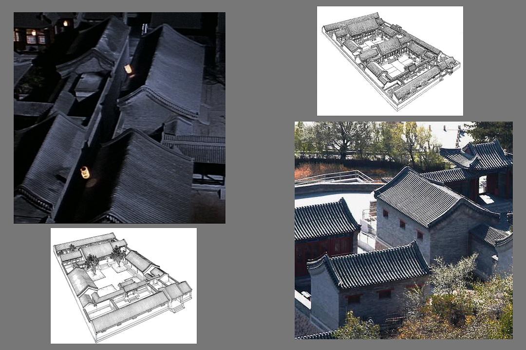
Here are a couple of samples I put together for study purposes. The upper left is from the movie "Courching Tiger & Hidden Dragon" and the lower right is from a tourism site. The sketches are from various sites regarding the court houses (obviously no challenge of copyright is intended, this is just for research).
In the images I see that there are two versions for the roof type I am going for and both much steeper than my almost flat end of the first attempt. Also there are some that are symmetrical and others (usually when there is a large veranda) where there is a extension of the roof on that one side.
So I basically redesigned the geometry for the roof curving and here you can see the new build with the old for comparison. Looks much better now ... and my girl friend agrees :-)
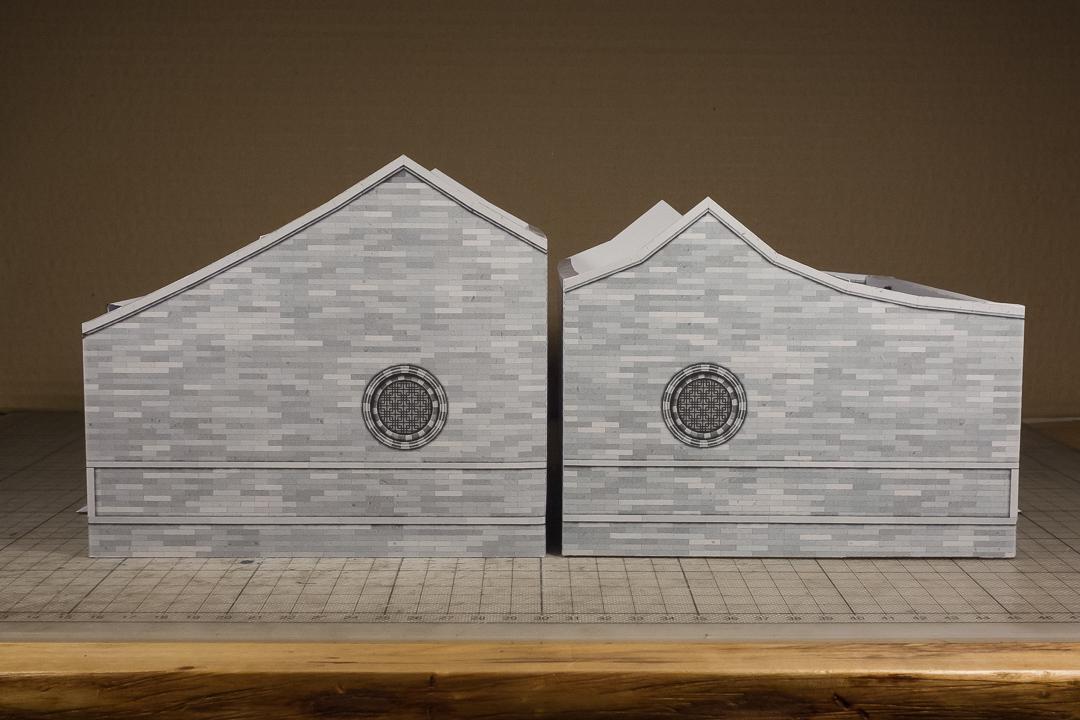
This asymmetrical roof will be for the large main buildings. For the smaller extension buildings I will go for the symmetrical one. I will show module and layout sketches in the next days, so you can imagine how the different parts will go together.
Another thing that I realized when I took a closer look is that the size of details is so important. When you look at the triangle shaped side detail ornaments left and right from the column - as much as I thought they were readable and looked nice - they were way too big in comparison to a mini. We have an instinct about these relations and with that size the column part looked too small.
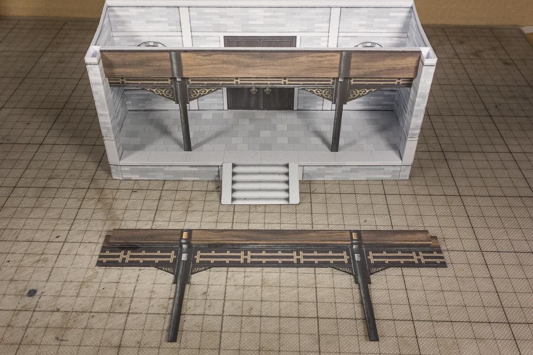
One updated try was the one lying on the ground in the front. Here the column side details have the right size and make the columns "look larger". I also changed the ornaments in the panels but in this try I went from too small to too large!
So in my final attempt (I'll repeat the top image) I also fixed the panel design with the typical Chinese patterns. I made the lower panels higher and reduced the top bar. I also changed the color. Now they have the right size and look! At least to my girl friend and me :-) Let me know if you disagree!
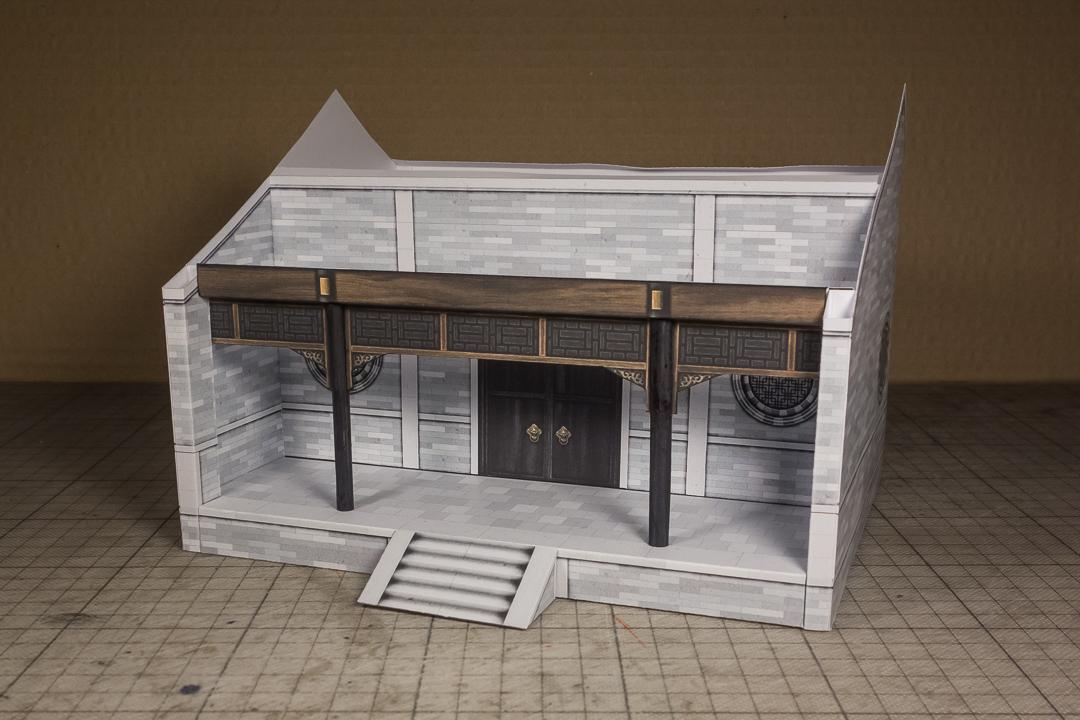
One more thing I will update is the door size. I think it's too high. I misread a blueprint I was using and I think I will make it one centimeter smaller.
So now I hope to finally go back to the roof!
Until next time, have fun & keep buildilng :-)
Chris
Papierschnitzel
2019-01-25 15:11:56 +0000 UTCAntonio Mendoza
2019-01-25 09:43:08 +0000 UTCPapierschnitzel
2019-01-23 16:34:23 +0000 UTCAntonio Mendoza
2019-01-23 15:42:24 +0000 UTC