So all the kings, wizards and scullery maids culminated in this orange furred cat jester and his schizophrenic existence. Privileged status and an object of ridicule. Closest companion of the king and sleeping in the attic in an empty soap box. Not self assured, a little cranky and endowed with an endless, even dizzily bounty of hope. Other servants ridiculed his adoration of the princess, and when he'd retort “She shall love me!!” one of his fellows came back with “HAW! HAW! Yeah! An' I'm Charlemagne!”
At the time, I was feeling put upon myself. I was still in my familial headquarters, and thankfully, my father was showing up less and less. There was only my assurance that I'd be a success in my profession that served as my battering ram, despite my insufficient technique and an archaic style.
The visual style was genuine. In my childhood, I was trying to match the Betty Boop movies I had on 8mm silent prints. The films ran at a slow speed, making the droopy, curling movements seem even more lush. And there were layers of motion. I stored the images in my brain and tried to approximate them while at school. Back then, it may not have been so strange, because there were still commercial illustrators like Lou Brooks that had full pages in magazines. Probably following R. Crumb's lead. So were television commercials for products like Shasta Cola and Screaming Yellow Zonkers. YELLOW SUBMARINE (which I loved) was out, and, looking back, the 1970s were a very alive time for the graphic arts.
By my late teens, I had forgotten that I was doing an “old” style. I do know I preferred old cartoons and comics, but I was not slavishly copying them. I remember saying to my mother at age 14, “I do not want my art to be inspired by anything else!” She corrected me, saying “you mean influenced.” She was right, that is what I meant. If I was influenced, ah, inspired by anything else, I would skewer it on purpose. I was doggedly determined not to be outed as a creative thief. Someone said “Go ahead and swipe! Nobody would know.”He was right. But in the web world now, somebody might find out.
About this time, I saw some posters at a friend's house; old images of sexy women drawn with thick, hard outlines, like a stained glass window. “Oh, that's Mucha.” Investigating further, I became a Mucha head and bought every reasonably priced book I could find. Further down that route, I got into Art Nouveau in general. It wasn't as much the intricate details as the clear, bold lines and the off centered compositions that had been inspired by Japanese prints.
And speaking of those, on a visit to a book store annex, I found IMAGES OF THE FLOATING WORLD and 250 YEARS OF JAPANESE ART. Both were volumes of the history of Ukiyo-e, the printed images of geisha, prostitutes, modes and morals of “everyday” Japanese life in the 17th to 19th centuries. Again, the lines, the staging, the wide open, empty spaces that were vital parts of the picture.
One book, just called ART NOUVEAU and containing black and white illustrations made me think, Why must a comic page look like a comic page? Or inspired only by other comic pages? So I worked to incorporate all of the above into my own work.
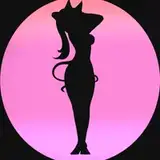
The castle Hugo served in had, when I was at my best, flowering, towering Nouveau columns vined and twined, opening into a sea of greenery. Princess Trish was a comic spin on a Mucha girl, with revealing translucent gowns held up by mazes of chains and straps. Then as now, I wanted to create a world of cartoon splendor.
There is a new entry on me in "Grokipedia". Some facts are off, and it's probably AI, but I'm ok with it.
https://grokipedia.com/page/milton_knight