Kemonomimi Month Post-Mortem: "Morning Dreams"
Added 2024-12-06 21:34:35 +0000 UTC
Kemonomimi Month Post-Mortem: "Morning Dreams"
------------
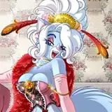
👯 The Erotic Creators Group's theme for CY2024Q4 was kemonomimi, humanoid characters with animal characteristics. We were encouraged to make some subject matter along these lines to showcase our work and build our esprit de corps.
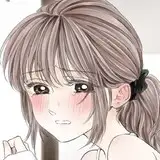
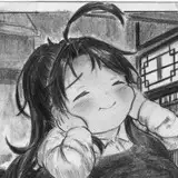
📚 I took this opportunity to research the styles of manga, Japanese comics, often designed for a younger market, for low-cost black and white production. I have the Clip Studio Paint, after all.
👵 As always, this experiment reminded me how old and out-of-touch I am. My seminal inspirations include Tezuka, Obare, Monkey Punch, Hara, Shirow, and Ishinomori. Even the "modern" artists I like, such as Toriyama and Oda, are over three decades old! Certain styles of hair, eyes, and mouth can be see as painfully dated or cliche to modern audiences.
👥 An open secret is that manga is drawn in teams. Only one artist usually gets the credit, then their assistants take care of finishes and those many, many screen tones. (Apparently One Punch Man's manga has a crew that's so large, there's an assistant supervisor to coordinate them!) Just like US comics have their pipeline, JP manga have theirs, and this process informs how the comics are made.
▒ Even though modern manga are made on computers, the style is fairly aggressive about using old-school tones . While a digital machine can do any pattern you like, the examples from pro-grade stuff that I found always used only certain fixed values or specific linear-line gradients. I didn't. I took full advantage of the software's ability to have all kinds of tonal gradation and patterns, I do wonder what I'd get if I toed the line.
📃 The process I settled on was 1️⃣ rough pencil, 2️⃣ marginal block-in using ballpoint pen or thin brush, 3️⃣ uniform tone, 4️⃣ erase pencils, 5️⃣ inking finishes with heavy brush or wide roller-ball pen, 6️⃣ advanced tones, 7️⃣ finishes, usually with ballpoint pen. You can see those results here. It was pretty fast and gets good results.
🤔 I have the rough outline of a web comic here, and now I wonder if I should be doing it in color or in this black-and-white manga style. I do worry that my art is less "manga" and more "1980s black and white boom", with art that skews more towards Howarth, Mitchroney, Sakai, Kazaleh, Shaw!, and the like. Am I living in the past? They say make the art you want to see in this world.
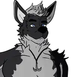
🐺 Oh, why werewolves? I used to draw so, so, so many emo werewolves. (Speaking of living in the past.) So this art is a gift to Teenage Xin, who won't be stepping twice into this river any time soon. As much as I love "urban fantasy", Grandma Xin gets far too hung up on the problematic elements of these stories and that's fodder for another post.
⬅️ It's designed to be read right-to-left, thought that really only matters on the first page. I tend towards long horizontal panels.
字 Don't get too hung up on the text. It's deliberately baffling to machine translation. Manga balloons have specific styles and shapes, styled for vertical text that can be very dense.
🙏 Thank you for coming with me on this journey of aesthetic discovery. This is just a small happiness I can give to you. Enjoy the present while we hope for the future.