SamuZai
AB Software
AB Software

patreon


Comparative image

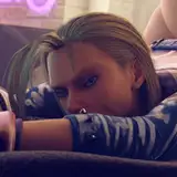
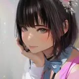
Number 1 comes out of Daz Studio without any modification, which is what I've been using for the game so far.

Number 2 is modified using Lightroom.

I find the result quite impressive; the colors were bland until now.

Comparative image Comparative image

Comments

Both look good but 1. looks more natural because 2 has too much color.

Kyssmyass

I agree it does look better, but maybe tone it down like 5-10% or something. Or maybe do a couple of images in a couple of different levels and let people vote on em. Obviously final say it's up to you, just an idea to crowd source the answer.

Aaron

yes, a little bit, you're right

Aimander

I feel like image 2 might be a tiny bit oversaturated, but that might just be me.

Aaron

looking at the images alternately gives the impression that number 1 is in black and white lol

Aimander


More Creators