Hi, hi, hi! I hope you're all doing well and keeping warm as the chill of winter slowly looms on the horizon. Don't let the hooded girl get you, lest you be subjected to her chilling lips, aaaa
So, I'm really excited for this week's dev log, as I've been super busy over the past week, working on all sorts of different aspects of the project across all fronts, and am proud to present the fruits of my labour!
First of all, I put it off for a long, long, loooooooong time as I was fearful of how much work it'd be to gut things and replace them--but most of the new UI is now in place! Since the title screen was already new, this largely revolves around the Save/Load screens and the Options screen, having finally cast free the shackles of the old template I had gotten used to. (Taken from Chapter One, which itself had been taken from an ancient project of mine before that, haha)

First up is the options screen! Utilizing the same sort of parchment aesthetic as the main menu, I opted for something really clean and modern here when I was getting the UI elements commissioned. It simply presents all the options you need without too much visual noise while keeping a slick and professional style. At least, I'd like to think so--especially when you compare it to my amateur attempts before. I'm a lot happier with how things look now and it gives Chapter Two its own identity now, rather than just feeling like a bolted on extension of Chapter One.

Up next is the save/load screen, noticeably different in style compared to past iterations, while maintaining consistency with the layout of the Options screen. Since, as you can see from the banner along the side, you can swap to each of the screens easily, and they all adhere to the same sort of general layout as to not feel jarring between each menu.
Here I took the liberty of bolstering the resolution of the save slot thumbnails, and shifting the information of each slot below it, rather than cramming it on the side. This was a lot more work than I anticipated to get everything to play nicely without breaking, but after wrestling with the scripting enough, I was able to get everything positioned as desired! Not everything is perfect, as I'll probably toy with the font size and font type down the line, but it's at quite a good level now. For those concerned, while there's a listed '7' pages of save slots, it actually extends far beyond that if you keep hitting 'next', since you'll be granted additional pages of saves.
The reason I put off making these changes to these menus for so long is because I was fearful of the amount of work it might take to replace what was already there--and to start anew with positioning things. As for the bulk of these menus, their elements are handled through what Ren'Py defines as 'imagemaps'. These are pretty handy things, and simply allow you to upload an entire UI worth of buttons in clicked and unclicked states--and then you have to do the grunt work of working out alllll the coordinates for each button, and the size of each clickable box--and then subsequently work these into the ground and tag each set of coordinates with an action, such as starting a new game, opening the Save/Load menu, and so on. It sounds scarier than it is, really. It's just a lot of poking around in an image editor to get all the right numbers for everything and making it all aligns! It's just a lot of mindless work with numbers.
Other elements that aren't locked into place on the UI or are more interactive, such as the sliding volume/text speed bars are a bit more involved than the imagemaps--and require far more careful manual placing and aligning. A bit more finicky, but I was able to keep on top of things with enough fussing around. The important part was to not let the frustration get to me when things broke, and just calmly assess why they came out wrong, and to look for a sensible solution, either by intuition, or by searching endless pages on the internet. This is pretty much how I handle all coding scenarios--and with enough headbashing, I get results! I just have to hope I don't come out with some kind of head injury after all of this, uwaaa...
Anyway--with these major UI elements done, I feel a lot happier with the state of things--and it's slowly evolving from a clunky alpha to something a bit more polished, and dare I say 'professional'--all important steps I'm taking in the build up to HOPEFULLY releasing what I have to a much wider audience come the end of the year. My goal is to get things as sleek looking as possible to attract as many people as I can!
There's still a LOT of work to be done though with some of the more interactive menus, such as the status/inventory screen, and the relationship screen--but these should all be done in time, too now that some of the more difficult parts have been tidied up. I'm torn on the dialogue box and font and wonder if I should change them this far into things, as admittedly I've grown quite fond of the minimalist style of them, and risk changing the entire feeling of things by meddling with these elements now. How do you guys feel about the dialogue/choice boxes? Do you feel they suffice as they are, or would they benefit from a facelift like the other UI elements have had so far?
Moving away from the UI side of things for now, as you may have seen from that rain test video I uploaded before, I'm also experimenting with some flashy visual effects that will be used during some combat scenarios to really add some punch to things. Think along the lines of sword slashes, and impact marks, along with the occasional splatter of blood. If you're familiar with how Fate/Stay Night handles its fighting scenes--that's sort of the general style I'm trying to emulate, where a lot of motion and impact is implied through fewer images, but with clever use of transitions, sound effects, etc. It's not quite ready to be showcased in videos, but I hope to have something fun to demonstrate on that front soon!
And of course, alongside the UI coding and effects tinkering--I've been writing still alongside all of this! I don't want to promise anything too concrete, but want to try and get a new alpha build up by the end of the month, which will feature a whole host of new events, both h-scenes and otherwise, along with inching my way forward towards furthering the main plotline. If I want to make my end of year early launch a success, I have to aim for as much content as I can muster, after all! Even if I already think there's quite a lot to justify a release as it is, I'm going to push for as much as I can. Even if it kills me! Hraghhh!
It's been quite a lot of fun to tackle several new scenarios and build up the narrative behind them--since I view each side quest as its own little mini of story of sorts that plays independently from the main story line Matt has found himself thrust into. Sometimes when a particular scene begins to get mentally exhausting, I swap to a different scene for a new frame of mind--and can then return to the other scene afterwards with a new perspective on it, often able to smash through the block that was holding me up before. That's always a fun feeling! One of these h-scenes in particular is something COMPLETELY different than what I've written before, so I feel like I'm in new territory and won't risk falling into old, repetitive habits. I really do hope people will like this one--even poor Matt does suffer a lot!
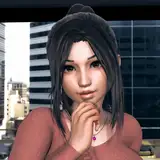
The above screenshot teases the beginning of a new quest--where Matt is inquiring as to acquiring some tools required for a very difficult task. I wonder what it is he might be trying to hunt--and what sort of tools he'll need for the job?
So--while wrapping up this week's dev log, I wonder--how do you feel about the new UI elements? Do you prefer them over the old ones, and consider them an improvement? Things are always open to being tweaked and edited, of course and nothing is set in stone thus far. It's always good to gather feedback this early on!
For the next dev log I'll try to showcase some of the flashy combat animations in a fun little scenario featuring Ren. Combat is where she shines most, after all, even if you wouldn't think it from your past interactions with her!
Until next time~
Frostworks
2019-10-22 18:20:52 +0000 UTCtugli
2019-10-22 07:00:30 +0000 UTCFrostworks
2019-10-22 00:04:04 +0000 UTCtugli
2019-10-21 11:55:28 +0000 UTCFrostworks
2019-10-19 14:39:11 +0000 UTCCollin Douglas
2019-10-19 07:13:04 +0000 UTC