SamuZai
Weird World
Weird World

patreon


Title Screens

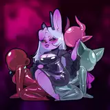
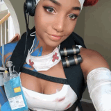
Yo, its been a while since I've changed up the title screen and the page image on the sites this game is on, I don't even think I have the first one anymore, lost it when my hard drive got fried. But I've been thinking maybe its time I changed it. I've attached two files, the current title screen and what may be the new one. In your guys opinion, should I change it to the new one? Which one do you think would get more people to click on the game? I'm not really sure myself.

Title Screens Title Screens

Comments

i feel you should keep the old one and after the new art is introduced you use the new one with at least one monster incorporated into it

yuigoto

yeah there are no Monster in the new one. those are kinda missing there. ^^

Daniel Klein

There are two very important things that are missing from the new one in my opinion. The first one is that the old one has tentacles. That immediately screams to me aliens or supernatural stuff or something like that and gets my interest. The other are the nipples, which makes it very obvious it's an adult game, again making me more interested. The new one, while it looks better from a design and art style perspective, doesn't show anything distinct from the other hundreds of game banners I've seen and I feel I would be a lot more likely to skip it. Personally, I would change a couple of the characters for more unique and interesting looking ones, of which there are plenty in the game.

Ignatius Carl Winston

Definitely agree with that. It's one of the major draws to the game overall. The monster designs are *chef's kiss*

Rom

A fusion between the two would be better.

Nyx

Agreed

KPsyChoPath

I feel like your title screen should incorporate monsters in some way. Random attractive women could be a part of any game, but the monsters are something unique to this one.

Statue345

The new header makes it look like those 3 are getting powers too.

Nephibis

I'd say the new one is more suited when it comes to the marketing department, considering it features the new and improved art style and also showcases several of the sex-able female characters - because while it is easy to forget due to the engaging story, Superhuman is still a porn game, and I assume it is that fact which attracts most people into giving it a chance to begin with.

VastJacobst

The new one is done better, which is a great upgrade. Why not add the monster lady to her part in the new screen too?

SailiMegami

I honestly really like both but the new one is really raw and powerful in a way I like.

Wolf

The new one better represents the new art style. The old screen however better fits the vibe of the game. Perhaps you should pick one of the newer monsters for the title instead. That, or at least add one to the new title. Also, on my screen the title text isn't as readable on the new version.

MrMauve

The first one looks better for people coming in. It shows that this is a H game, while the second gives off Lewd game vibes.

Da Ninja

I'll always pick the old one, as it was what initially drew me into the dark narrative.

Rom

New one--the older one has a better creepy vibe, but the new one looks better quality and features characters that we regularly see. That said, the art discrepancy is getting a little extreme . . .

Hursha

What he said with a passion!

ShadowDrake

The new one is cool to say the least, I'll wait to see what the consensus is...

Ploot Ploot

They are both great, and the new one does look better than the old one. It looks like it might make a new user curious about the characters on the image and click to find out. However, I have to go agree that old one really set the tone for the game. The old image is like a symbolic cover that gives implies the themes of the game without words. While the new one which seems more attention grabbing and sci-fi due to all the bright colors.

Dragonlord 1024

I wonder if using a persistent variable at some point during the story (maybe after MC is exposed) to switch the title art would be a good middle ground. I really like the new screen, it shows your evolution as an artist, at the same time the old one is a classic. Someone else here mentioned the shift in tone from 'on your own survival horror' to a more 'superhero X-Men story', and I think the art changing partway through could reflect that nicely. Just an idea, I like them both

Khouserv

I agree that having the new art that isn't present until later in the game might make some potential players feel misled. That being said I really love the new title screen

MW5649

Old title screen is much better!

Jussi Haili aka Jussi138

I think the new one would be more eye catching, but for new players coming into the game the original is more relevant to the beginning of the game. I really do enjoy how ominous the single large character is. She's sexy but is she friendly? Before the game became what it is now (more like X-men) it had a lot of exciting horror elements that disappeared with the progression of the story. Is the government after me? The mafia? Dave's crazy ex with the psychotic eyes? The aliens? Bounty Hunters? That element of the unknown and your relative powerlessness to deal with a veteran fighting force works to your advantage as a story teller and could also be tapped into for a good title screen. I don't think showing art from the second half of the game would be the best choice, but the extra color you have with multiple females will get you more attention.

Zeban

Out with the old in with the new

Skeleto

Could there be a middle ground

Lalaargan

While the tits are hot lmao def like the new look

Parcival333


More Creators