Hopefully, this will be the previous before the last update. I'm in the final trace, but can't say when I'll release it. Here are 3 scenarios:
1. The most optimistic: Release around the 20th.
2. Realistic: A Christmas gift.
3. Pessimistic: The 3 kings advanced gift (before January 6th, the day we celebrate in Mexico when the 3 kings arrived to Jesus's birth).
The game is running, but there are still some features and scenes I want to add plus the final quest. Now, I'm doing the library quests which will integrate the Spankingverse. I know I can finish everything for the 20th, but it would depend in the final review. If I find something that's not working, I would prefer to delay the release and give you a top game instead of something that is not close to 100% finished.
Here's a list of the things I will add and also another of the things I said would happen, but I decided to push to the second part.
Things to add:
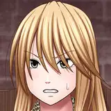
1. A CUM-O-METER. Greta's image above if for a consequence after playing RSP (Rock, Scissor & Paper). Only if Marco wins the match, he has the right to spill his juice. Otherwise it will be a huge DENIAL. Without a cum-o=meter these scenes would be half the fun.
2. Because of the CUM-O-Meter, I want to add more scenes with the girls.
Things that were pushed to second part.
1. Strip RSP. I loved that idea, but I preferred to push it to the game's second part. So, RSP will take place with fully clothed girls.
2. Punishments after Xtreme tournament. However, this doesn't mean there won't be consequences. Winning the wrestling tournament will be a huge progress for the main quest.
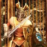
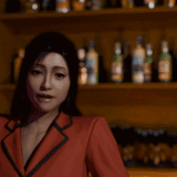
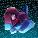
Here are a couple of images from the library quests, where Marco would need to investigate what's going on. Here are a couple of articles he will find. This is the part of the game free from spankings and NSFW, like any typical game where you need to get items to progress. In this case, it will be 2 major branches: The History of the Kingdom of Spankland, and the urban events happening in Spankytown.


This first part will consist of 3 levels, (8 in total), and it will entertain you for a while. Yesterday I made a review and it took 2 hours to complete the intro.
I hope I write the last update next weekend. Wish me luck!
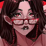
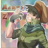
P.S. A quick question. Is the text below Zargana easy to read, or perhaps I should change for a simpler font?
Jason Voorhees
2023-12-20 00:15:05 +0000 UTCHecMX
2023-12-19 15:48:30 +0000 UTCJason Voorhees
2023-12-19 14:52:13 +0000 UTCKen L. Black
2023-12-11 20:39:32 +0000 UTCHecMX
2023-12-11 01:11:06 +0000 UTCHecMX
2023-12-10 23:34:49 +0000 UTCdarthbrat
2023-12-10 19:45:09 +0000 UTCdarthbrat
2023-12-10 19:36:46 +0000 UTCdarthbrat
2023-12-10 19:15:34 +0000 UTCJonny Delahaye
2023-12-10 19:10:34 +0000 UTCHecMX
2023-12-10 18:28:10 +0000 UTCJason Voorhees
2023-12-10 17:48:35 +0000 UTCHecMX
2023-12-10 15:25:31 +0000 UTCdarthbrat
2023-12-10 04:45:18 +0000 UTCdarthbrat
2023-12-10 04:31:41 +0000 UTC